The Brief
Between larger school site designs, I worked on a new homepage for Vanderbilt's Study Abroad office (opens in new tab), as well as the program search tool.
Initially I was tasked with a bare-bones re-skinning of the search to match the new design system. The tool is used by more than 50% of students, and I couldn't help but look for ways to make the experience easier to use.
The current experience was pretty rough, but about all I was allowed to do was ask, "what can be removed?"
Original Search
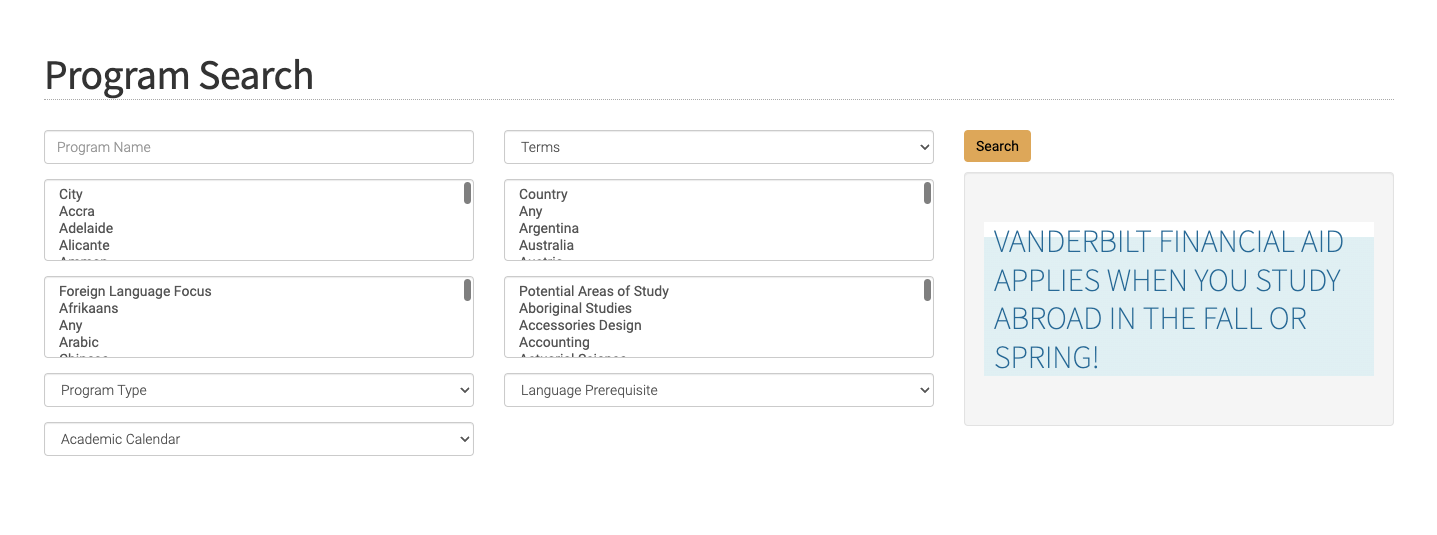
Field labels inside of selectors with no floating label pattern, so hidden once selected or scrolled away.
These long lists need a type ahead control, and country should come before city and filter down the city options.
Terms? What kind of terms?
At least it's bright! Could be better positioned.
Adding a Typeahead Control
Some of these lists had over 50 items. I scoured our documentation assets and couldn't find a typeahead control. Knowing that we had other database search tools in the pipeline, I pitched and secured approval to add one.
Storyboard for Dev
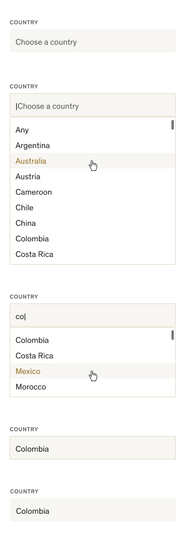
Rest
Active
First click brings cursor but hint text stays until first text entry. Show 9–10 results in alpha order with scroll bar on hover.
Search
Prioritize words that start with the letters entered, then show matches or any words with those letters next to each other
Selected
Field stays focused, with the border around it, until next click
Next Click
Clicking anywhere else leaves the control in rest
Negotiating Tight Constraints
My first idea was to include the program list below the search filters, having it dynamically adjust as filters were applied. This could have allowed for browsing and saved time loading the results page. After initially giving me the thumbs up, the developer realized it wouldn't be possible.
Non-final Design
Dynamic filtering didn't end up being an option because of technical constraints.
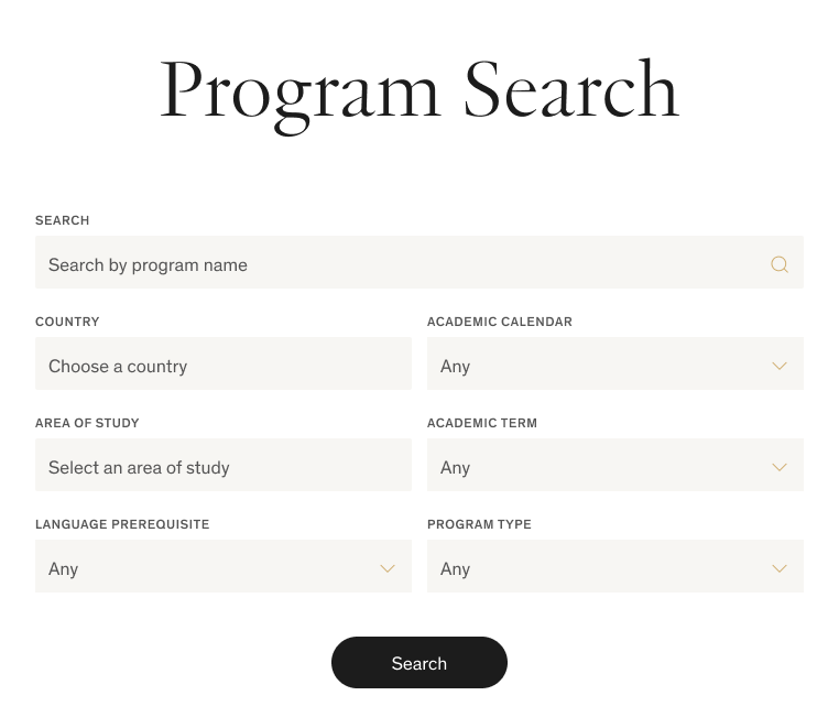
Least important fields (according to stakeholders) in lower right.
How Important Is This?
I love this question! I asked it of every field in the search filters, and was able to talk the stakeholders into letting us remove a few.
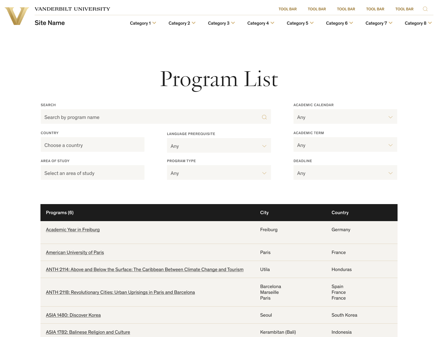
In the original tool, it was possible to select a city not within the selected country, returning zero results. Since there were at most 5 cities in any given country, I removed the city field altogether.
Final Design
Our new typeahead control in action, letting users search the list of countries. Cities now only appear on the results screen, saving user effort.
Reducing number of fields reduces user overwhelm and zero-results instances.
Prominent central Search button since dynamic filtering didn't work out.
Brochure Page Cleanup
Being fed by a database that needed (but was not going to get) a serious cleanup, it fell to me to remove the extraneous bits and highlight the most important pieces.
Final Design
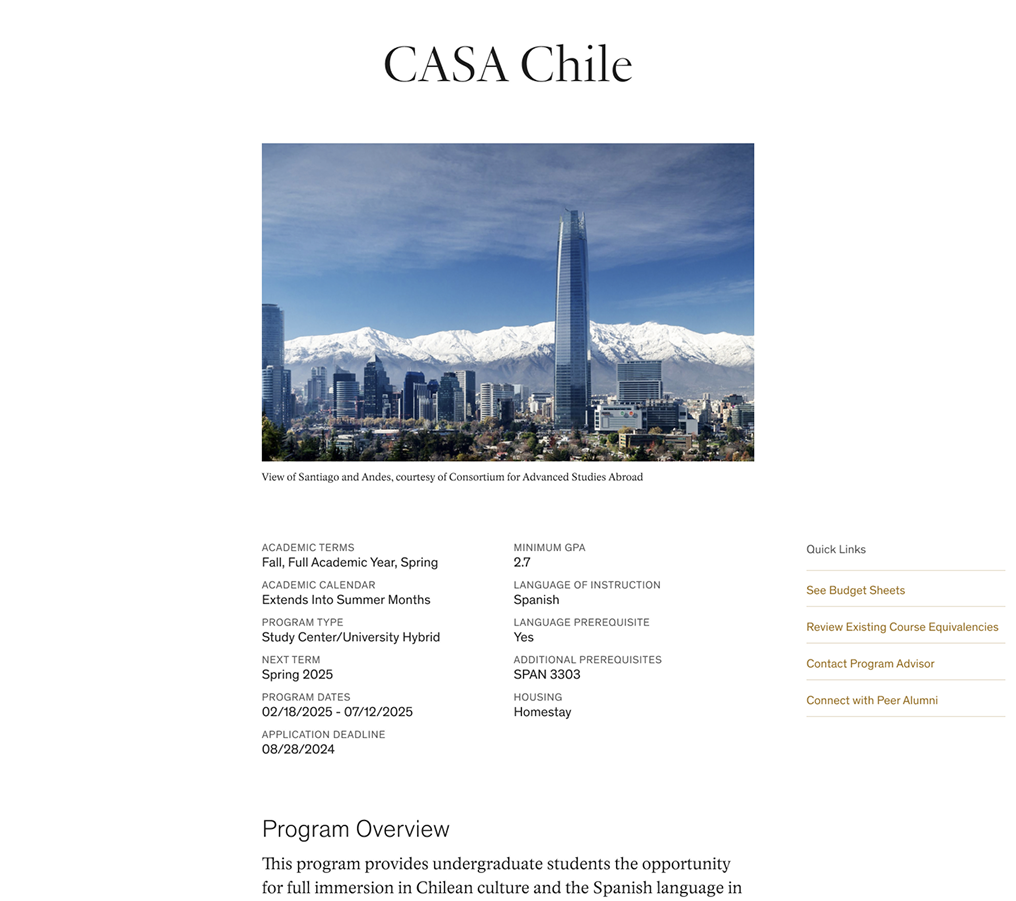
Image changed to 3:2 to save many awkward crops.
Most important info in scannable pairs at the top.
Important links moved to the sidebar for easy access.
Honorable Mention
There was plenty more I wanted to smooth out, but it was deemed out of scope. In addition to the improvements above, I also worked with the developer to include:
- A Change Filters button on the search results page
- A kind "no results" state giving users next steps
- Improved budget sheets with clearer heading structure and sidebar links for quick navigation
Outcomes
Usability testing was out of scope for the project. I did catch a few screen recordings in Hotjar showing users moving fluidly through the search tool, though of course that doesn't reveal their intent.
The developer was impressed by what we accomplished by just removing a few things and rearranging and restyling others. I also had an intern try it out, and she used it with ease.
You can use the Vanderbilt Study Abroad program search tool (opens in new tab) for yourself. It's admittedly still a little clunky, but a major improvement with minimal dev effort.