The Brief
The Digital Strategies team at Vanderbilt University oversees the design system and content management system (CMS) powering over 1 million webpages.
Initial research conducted by a contractor had shown that the building blocks for creating and editing webpages just didn't make sense to the people using them. Unorganized components had confusing names and clunky, inconsistent user flows. The goals were:
- Standardize naming conventions for component settings and user flows
- Rename some components to be more descriptive and intuitive
- Reorganize the component list into meaningful categories
Trimming the Clutter
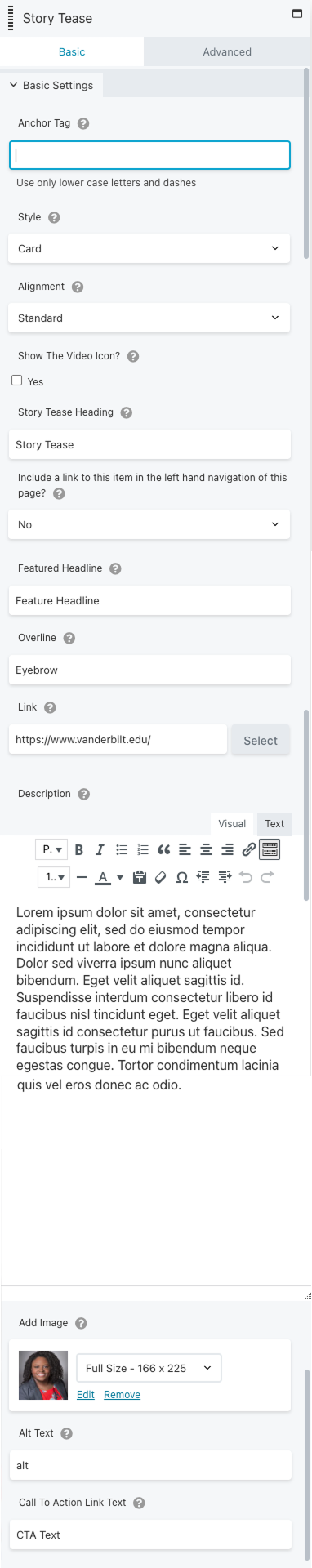
Many components in our design system had little-used or nearly unusable layout styles with names that didn't describe their features. The Story Tease component had 4 layouts — 2 were unnecessary.

Standard Style
This is nice except for the double heading. Keep. ✅

Featured Style
Wait, why is this different than the Standard one? ❌

Card Style
A nice variant with a background color to help break up the page. Keeper! ✅

Simple Style
Simple? I guess it doesn't have an eyebrow…or a CTA. When placed on a page with a wide content column, this image became so large it filled the viewport. It's out. ❌
Removing the Guesswork
With those two layouts removed, I got approval to add the ability to swap which side the image appears on. The trick was staying within the out-of-the-box styles of BeaverBuilder, our drag-and-drop page editor.
Old Workflow
New Workflow
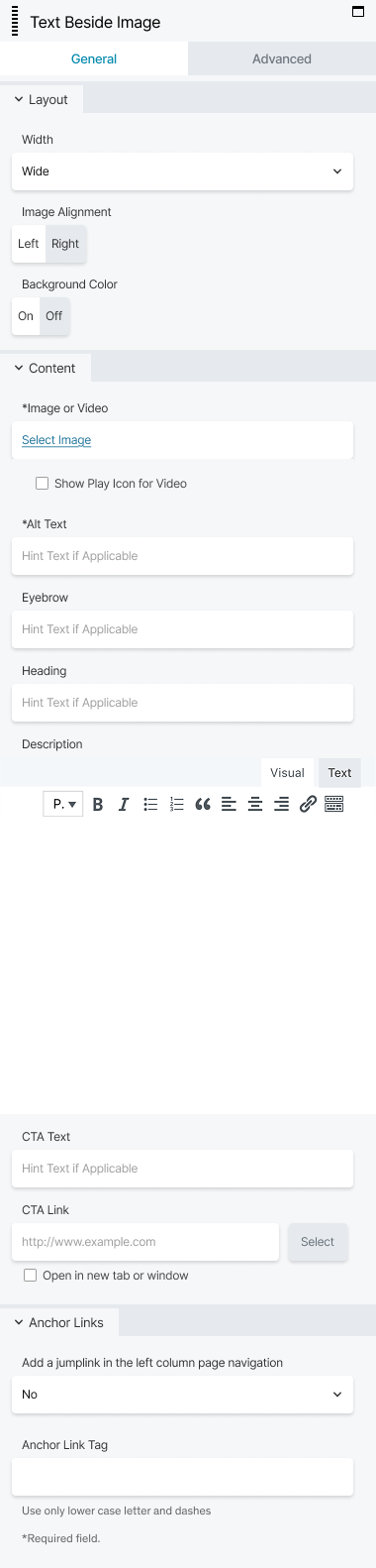
I knew from research that the first thing users thought about was layout options, so I grouped those at the top.
In the plug-in documentation I found another type of control was available and turned styles that had been hidden behind a dropdown into simple A/B choices.
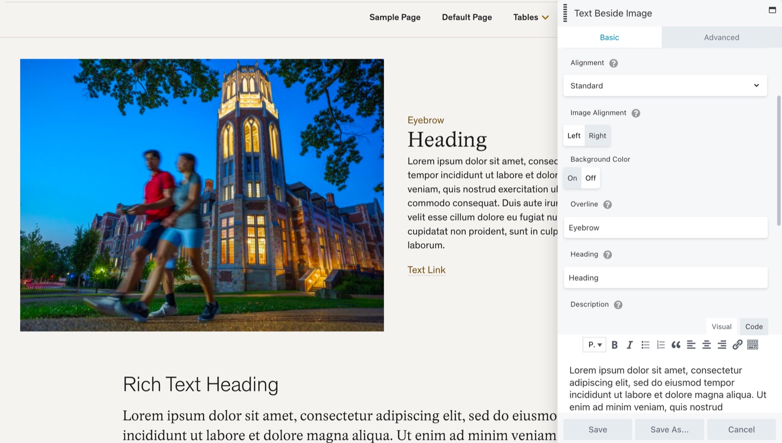
This section is laid out how the content appears on screen — top to bottom, left to right.
Checkbox and Alt Text fields are now next to the Image and Video field they effect.
Extra Heading field removed to avoid confusion and lock in the better visual choice.
These two lovers are no longer separated by an ocean.
Least used section to the bottom of the panel.
Standardizing Workflows
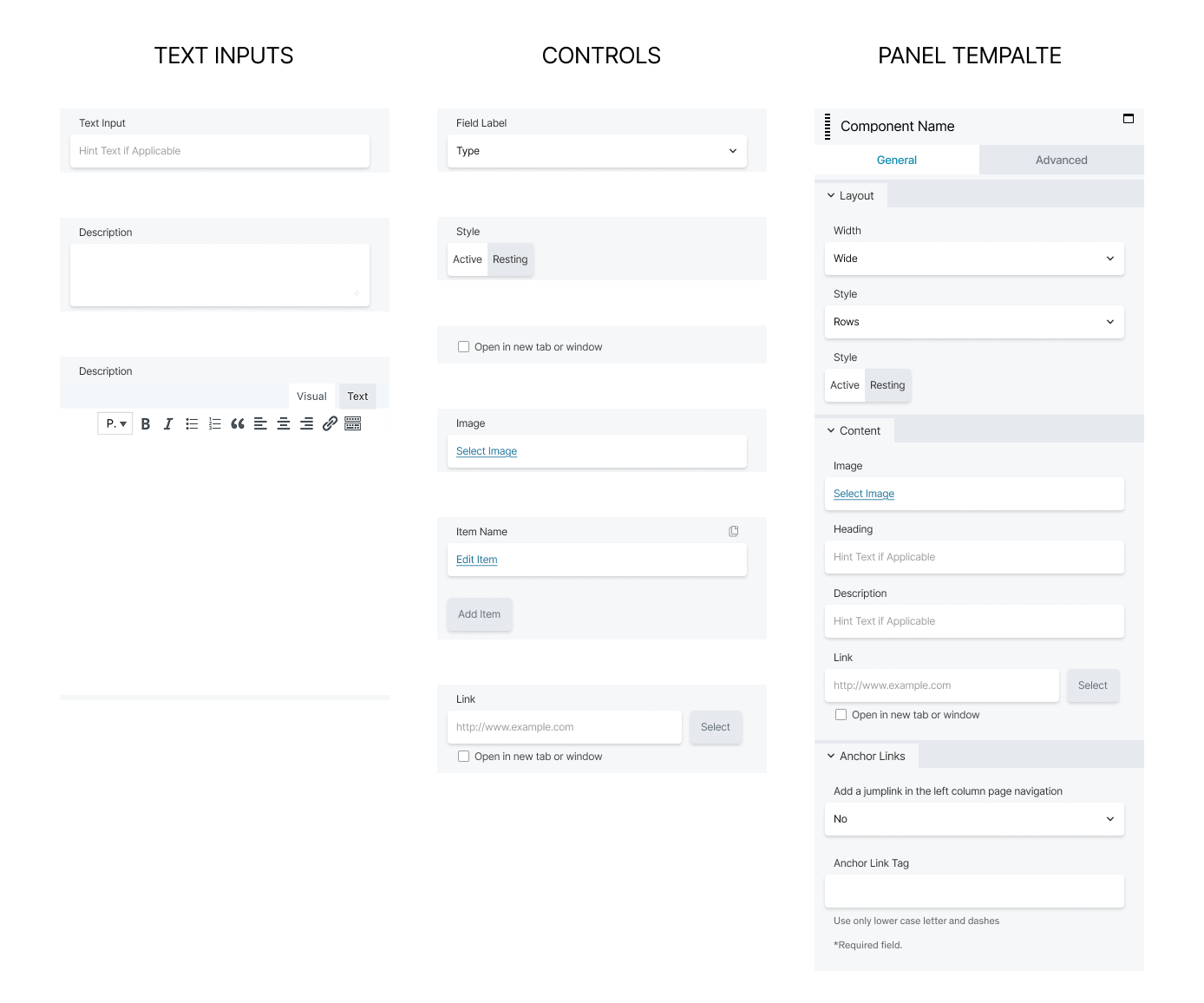
One component down, 61 to go! Next, I built a mini design system in Figma of all the controls that appear in the BeaverBuilder panel when users add a new component to a page. This saved time by making it easy for other designers to mock up these workflows and brought clarity to dev handoff. I also laid out best practices on our documentation site.
Mini Design System of CMS
Intuitive Component Names
The design team determined that nearly half of the components needed better names. Some had been built for one purpose and quietly repurposed for another, carrying labels that no longer reflected what they actually did. Working alongside the content and development teams, we asked a simple question of each one: does this name describe how the component can be used?
Here are a few examples:
Component Name Revisions
| Old name | New name |
|---|---|
| Button | Buttons Left Align |
| Button Group | Buttons Centered |
| Story Tease | Text Beside Image |
| Home Promo | Promo Bar |
| Resource Card | Call Out Card |
Meaningful Component Categories
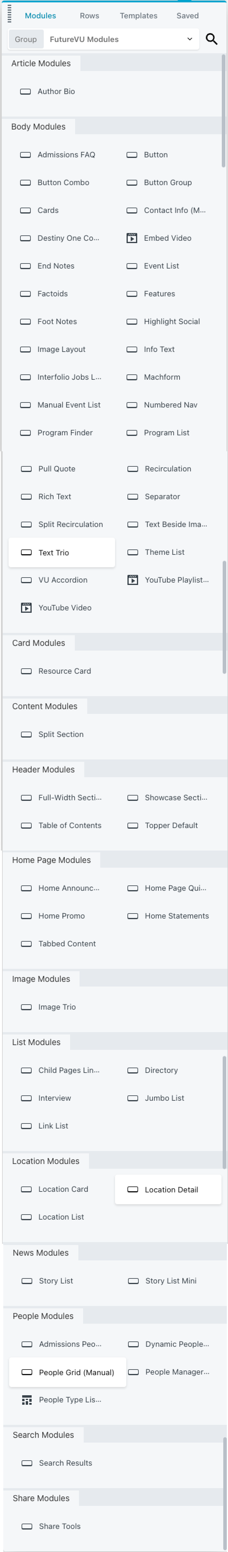
The other problem was findability. Every component lives in a drag-and-drop sidebar editors use to build pages. The vast majority had been lumped into one large, undifferentiated group. Less like a toolbox, more like a junk drawer.
I ran a card sorting exercise to understand how editors actually think about these tools with:
- 8 internal team members (power users)
- 5 web editors
- 1 AI chatbot
The capabilities of AI tools and my competency with them have grown since this project, but I didn't find much help at that time. I synthesized the data on a massive Miro board. Below is half of it.
Card Sort Exercise
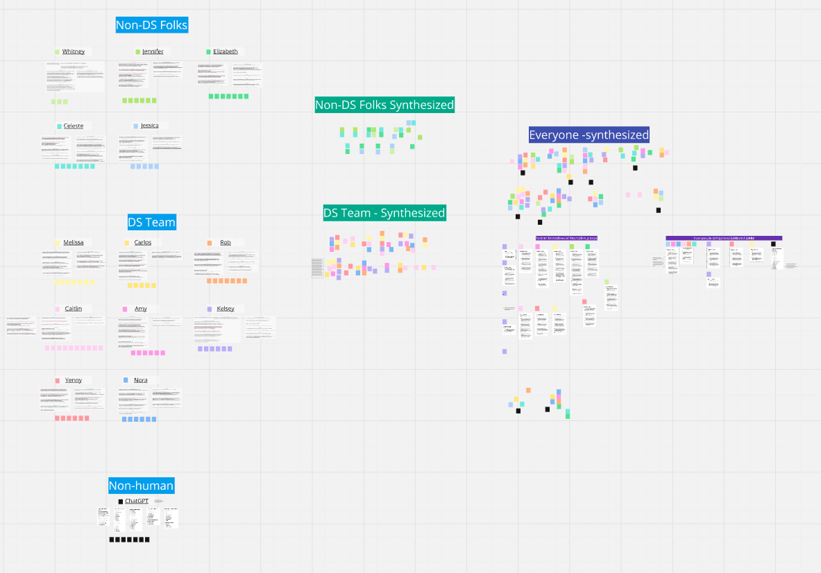
Some categories were clear-cut. Others took deeper thinking and follow-up questions to understand user intent. After several iterations, I presented my solution to the larger team and reached consensus.
Original Component List
New Component List
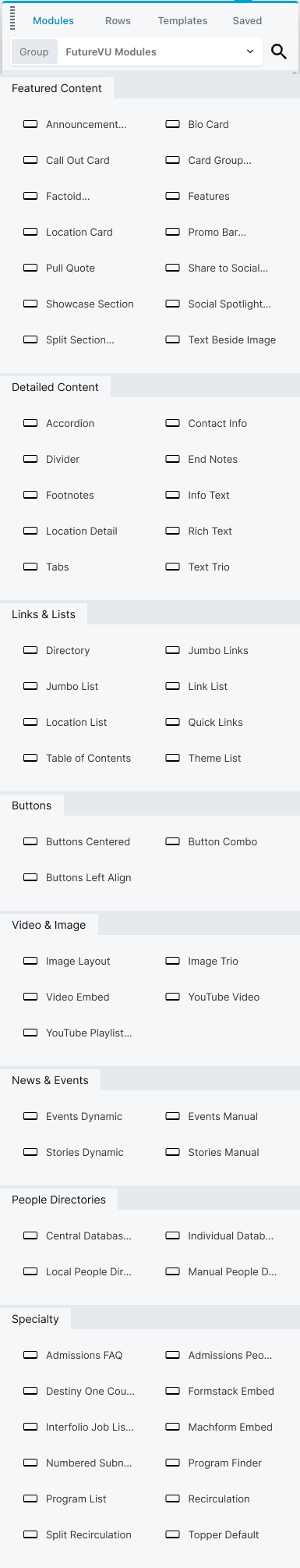
These top two categories placed the most-used components at the top of the list while splitting them up into groups that users seemed to have in mind when selecting a component.
There was enough overlap between lists and lists of links that it made sense to put them together.
It's not cut off! I cleaned it up this much, compared to the old version (left).
Security and institutional rules around incentivizing usability study participants make solid outcome data hard to come by. Several power users noted a time savings from having the most-used components at the top of the list. The real benefit, I expect, will be with new or occasional users finding components more easily and discovering ones they didn't know existed.
Updates to the workflows of individual components are still in progress. I'm hopeful for meaningful time savings once a consistent, organized workflow is present in every component.