
The Brief
The Digital Strategies team at Vanderbilt University oversees the design system and CMS powering over 1 million webpages. The system was initially designed by an outside agency with a focus on an editorial style of top-level pages, but left us with no good way to organize complex departmental content within larger institutional sites.
Users couldn't move efficiently between related pages, and editors struggled to create experiences that felt cohesive without feeling disconnected from the broader site.
For instance, the Medical School site needed a way to feature each program's options while highlighting the program within a sub-navigation.
Necessary Levels of Hierarchy
- Vanderbilt University
- School of Medicine
- Programs
- Doctor of Medicine Program
- Admissions Overview
- Application Process
Previous navigation tools could only get a user four levels down into a site. Spoiler Alert: View the solution on the Vanderbilt School of Medicine (opens in new tab) site.
Usability Testing Competitors
My content strategy partner and I spent several weeks on competitive analysis, studying how other leading universities handled departmental organization. As we found solutions we liked, I facilitated usability tests on competitor sites rather than spending time prototyping our own versions, and crossed a lot of early ideas off the list.
Collaboration to the Finish Line
With all the learnings in hand, I wireframed the two most promising solutions and handed one off to a colleague to continue exploring.
Non-final Design
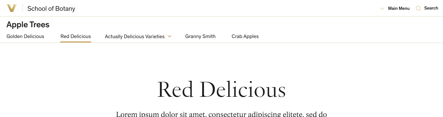
Link to Vanderbilt homepage and link to School level homepage.
Program-level sub-navigation supports dropdown menus.
Clicking here drops in the top-level nav with an overlay — shown below.
Non-final Design — Overlay State
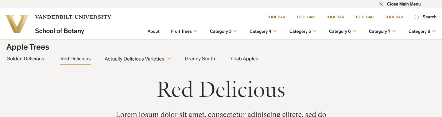
Access to the top-level menu without leaving a deeply nested page.
Non-final Alternate Solution (not mine)
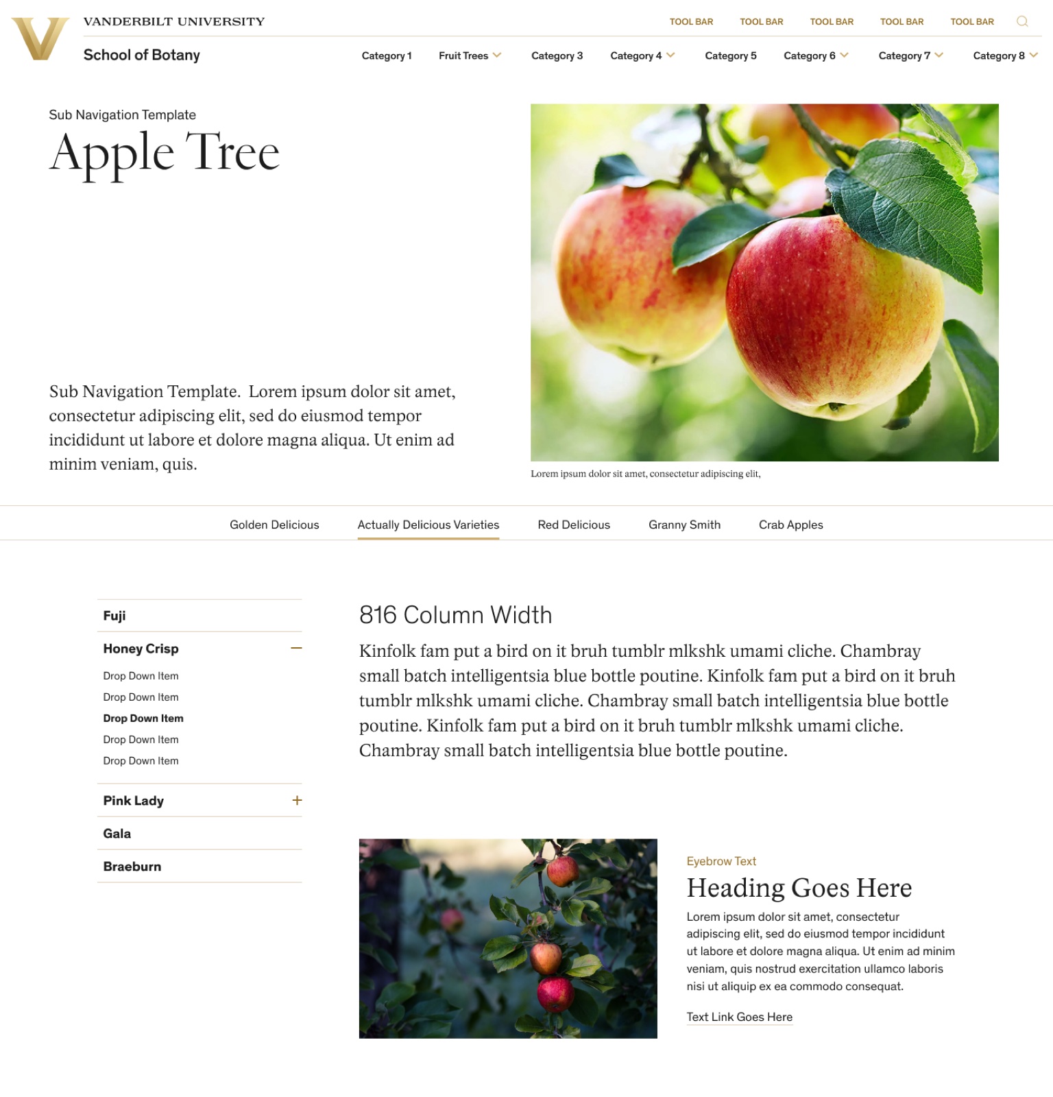
Top-level navigation always visible.
Program-level menu below the hero, borrowing from an existing CMS solution.
Deeper levels of navigation in a sidebar drawer.
Usability testing had shown that the alternate solution would need to be re-imagined on mobile. Ultimately, the larger team decided that its technical constraints would require more work than it was worth.
My design colleague and I focused on finalizing the favored plan, refining responsive solutions for all screen widths and color solutions for our 3 color themes. The Secondary Navigation was born.
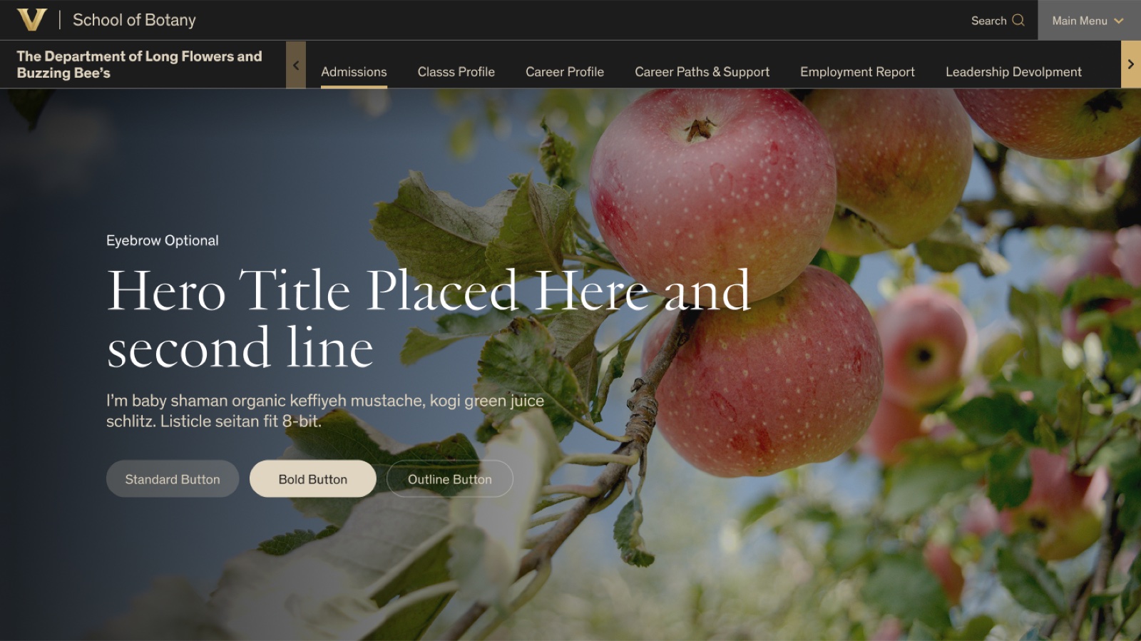
Final Desktop Design
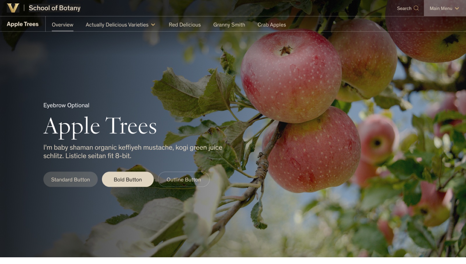
Available on the system's two most-used page templates, with several hero options to choose from.
Top-level nav access gets a distinct button treatment for greater visibility.
Final Tablet Design
When the viewport is too narrow or the user scrolls, a background color makes the nav easier to read.
Scroll arrows reveal nav items that don't fit in the viewport width.
Final Mobile Design
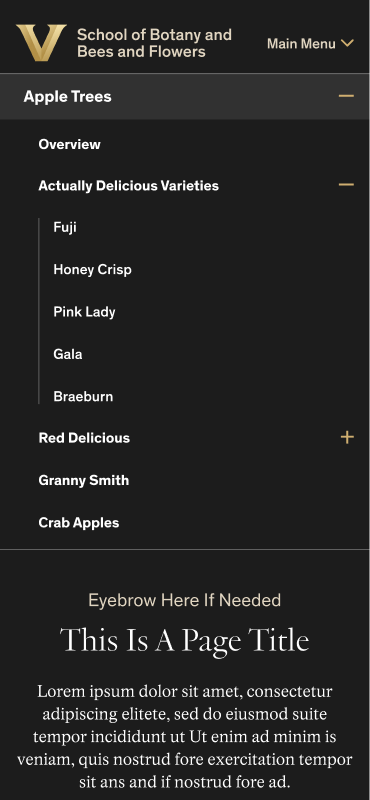
The Secondary Nav opens by default to preserve users' sense of place. It collapses on scroll or when the minus icon is tapped.
Partnering with Dev
I prepared a prototype and all the variants and states for dev handoff, then partnered with the developer to resolve things we had missed and other constraints he encountered. After the Secondary Navigation released, we found a few bugs and quirks that we straightened out in a follow-up release.
30% Drop in Search Reliance
Since launch the team has had other priorities, but I'm looking forward to testing this solution against our previous one. My hypothesis is that it will reduce the time it takes users to find what they're looking for—and analytics suggest that's true. The new School of Medicine site, using the Secondary Navigation for programs, showed a 30% decrease in search reliance compared to the previous site.
See the Secondary Navigation in action (opens in new tab) on the Vanderbilt School of Medicine site.